|
JB DANIEL'S ART (AESTHETIC CALCULATION, LINGUISTIC EVOLUTION, AND SHOPPING) - (click on images for more info) J B Daniel’s art is exceptionally clear and immediately available, but where it takes you is not. Invariably precise and systematic, it exists in a wide array of both traditional and non-conventional media: found objects, framed paper works, collage, constructions, assemblage, installations, photography, and other graphic information. Through this variety of forms Daniel devises aesthetic concoctions with artistic merit transcending their active ingredients. Most of his pieces exist as conceptual constructions made from either single or multiple objects; these are normally common, commercially manufactured items and materials either presented out of context or altered in some way. Their identities dissolve into the artistic composites they create, but never completely because the finished works frequently seem to be disguising themselves slightly as situations and familiar things we’ve seen before that weren’t art at the time. UNTITLED, 2005 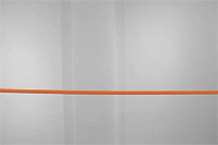 (Fig. 1) was a work exhibited at Chicago’s LIPA Gallery as part of a group show developed around the theme of “institutions.” In a room approximately 30 ft. long and 12ft. wide he installed a single orange power cord from one wall to another (the long way) at a height of about 7 feet. Both ends of the cord were fitted with plugs inserted into sockets mounted on the walls. The only other item shown in the room was a color photo ( 8 x 10 ) presenting an aerial view of a section of Michigan Avenue from Monroe St. north to Columbus Drive south. It had been altered to include an orange line from the Art Institute running down Michigan Ave. to LIPA Gallery in the Fine Arts Building. Both institutions were labeled in the photograph. The principal focus of the piece was its brightly colored cord easily observable from outside the room through a wide entranceway. Less conspicuous was the photo exhibited on an inner wall and noticeable only after completely entering the room and turning around. The immediate effect was striking; the big white room with its black floor was altered immensely by the simple installation of this one item connecting its two walls. Here was a solid orange line moving through the enclosed space generating an extended, shallow arc inverted and configured by its own weight. It presented an elegant balance- a sight to stay with and ponder but not for very long. After all, it was before anything else, just an electrical cord and susceptible to our pragmatic scrutiny, so more mundane considerations immediately broke its aesthetic spell. Is the wire hot? Why is it here? Why connect two walls, and would it actually work between two sockets like that? What is this about? These questions persisted in an odd tension with the orange line until eventually defused after finding and examining the photo. Exhibited here was the visual evidence for a concept piece formulated to instigate a connection between two art institutions. It consisted of a proposal that read: “ Run an orange power cord (approx. 1500 feet) from the Art Institute of Chicago to the Fine Arts building to power a 60 watt light bulb installed in LIPA Gallery. All negotiations to be made between the two institutions regarding city permits, construction and funding.” After initiating this idea for the two institutions to consider and negotiate he then illustrated his proposal as part of the group exhibition. In keeping with the topic he had activated institutional associations and deliberations, but more importantly, his UNTITLED was an exercise of aesthetic choice developed within the parameters of a theme. Another of his works developed is this way is entitled ROUTES (Fig. 1) was a work exhibited at Chicago’s LIPA Gallery as part of a group show developed around the theme of “institutions.” In a room approximately 30 ft. long and 12ft. wide he installed a single orange power cord from one wall to another (the long way) at a height of about 7 feet. Both ends of the cord were fitted with plugs inserted into sockets mounted on the walls. The only other item shown in the room was a color photo ( 8 x 10 ) presenting an aerial view of a section of Michigan Avenue from Monroe St. north to Columbus Drive south. It had been altered to include an orange line from the Art Institute running down Michigan Ave. to LIPA Gallery in the Fine Arts Building. Both institutions were labeled in the photograph. The principal focus of the piece was its brightly colored cord easily observable from outside the room through a wide entranceway. Less conspicuous was the photo exhibited on an inner wall and noticeable only after completely entering the room and turning around. The immediate effect was striking; the big white room with its black floor was altered immensely by the simple installation of this one item connecting its two walls. Here was a solid orange line moving through the enclosed space generating an extended, shallow arc inverted and configured by its own weight. It presented an elegant balance- a sight to stay with and ponder but not for very long. After all, it was before anything else, just an electrical cord and susceptible to our pragmatic scrutiny, so more mundane considerations immediately broke its aesthetic spell. Is the wire hot? Why is it here? Why connect two walls, and would it actually work between two sockets like that? What is this about? These questions persisted in an odd tension with the orange line until eventually defused after finding and examining the photo. Exhibited here was the visual evidence for a concept piece formulated to instigate a connection between two art institutions. It consisted of a proposal that read: “ Run an orange power cord (approx. 1500 feet) from the Art Institute of Chicago to the Fine Arts building to power a 60 watt light bulb installed in LIPA Gallery. All negotiations to be made between the two institutions regarding city permits, construction and funding.” After initiating this idea for the two institutions to consider and negotiate he then illustrated his proposal as part of the group exhibition. In keeping with the topic he had activated institutional associations and deliberations, but more importantly, his UNTITLED was an exercise of aesthetic choice developed within the parameters of a theme. Another of his works developed is this way is entitled ROUTES 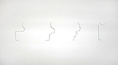 (Fig. 2) made in 2005 for an exhibition called T HERE that took place in two art spaces simultaneously. In one of the venues (Lobby Gallery) he exhibited 16 small wire constructions (about 3” high) horizontally embedded in the wall equidistant apart. Each of these depicted a specific route between Lobby Gallery and Nab Gallery that Daniel intended to walk with whoever purchased that configured possibility. Generated from his concern to convey a connection between two autonomous exhibition spaces his slender, elegant wire forms extended from the wall duplicating shadowed, less-focused multiples of themselves. This is how he makes art. The numerous subjects and issues his works address are but the agents for aesthetic embodiment. His creations derive from his looking and pondering informed by an acute sensibility by which he makes choices eliminating in the world that which gets in the way of art happening. (Fig. 2) made in 2005 for an exhibition called T HERE that took place in two art spaces simultaneously. In one of the venues (Lobby Gallery) he exhibited 16 small wire constructions (about 3” high) horizontally embedded in the wall equidistant apart. Each of these depicted a specific route between Lobby Gallery and Nab Gallery that Daniel intended to walk with whoever purchased that configured possibility. Generated from his concern to convey a connection between two autonomous exhibition spaces his slender, elegant wire forms extended from the wall duplicating shadowed, less-focused multiples of themselves. This is how he makes art. The numerous subjects and issues his works address are but the agents for aesthetic embodiment. His creations derive from his looking and pondering informed by an acute sensibility by which he makes choices eliminating in the world that which gets in the way of art happening.
His pieces often introduce information through language and symbols but mostly as factors in a more complete and integrated whole functioning to demonstrate content. When studied, his works’ complexities unravel but in numerous directions leaving more to contend with and more to resolve. Daniel creates situations that exhibit what he calls a “vibration.” This is a change that happens faster than merely switching from one notion to another or contending with the optical entanglement of visual ambiguity. Its effect is inherently aesthetic, and results from what the artist calls “disruption.” His Self Portrait 2004  (Fig. 3) takes the form of a small kit. It includes one row of five paper stamps (each 1”x1”) perforated for tearing and one stiff paper card with an imprinted grid on which to apply the stamps. Each of three of the stamps presents photographically a partial black and white view of the artist, and one has a consistent grain suggesting that it too is a part of the photo portrait.
The last stamp positioned perpendicular to the others is on the end of the row; it presents the title (“Self Portrait- 04”) printed at its bottom edge. The white paper card is about 3 x 4.5 inches and includes a vertically oriented grid 2 inches wide and 3 inches high. It visually reads in this position because five of its units include the word “paste.” The remaining unit in the lower right corner of the grid is blank. (Fig. 3) takes the form of a small kit. It includes one row of five paper stamps (each 1”x1”) perforated for tearing and one stiff paper card with an imprinted grid on which to apply the stamps. Each of three of the stamps presents photographically a partial black and white view of the artist, and one has a consistent grain suggesting that it too is a part of the photo portrait.
The last stamp positioned perpendicular to the others is on the end of the row; it presents the title (“Self Portrait- 04”) printed at its bottom edge. The white paper card is about 3 x 4.5 inches and includes a vertically oriented grid 2 inches wide and 3 inches high. It visually reads in this position because five of its units include the word “paste.” The remaining unit in the lower right corner of the grid is blank.
At first, this wonderfully novel self portrait seems straight forward- the four stamps showing the parts of the artist can be separated at their perforated edges and then pasted on the grid to make a complete coherent photo. The remaining title stamp can then be put in place on the grid. This seems quite simple, but entertaining the idea of actually engaging in this process of pasting immediately introduces additional issues. The kit does not come with instructions just visually evident clues inherent in the structure of its parts; these suggest the obvious but also strongly indicate additional options. There are five stamps but six places to put them. The empty area at the lower right corner of the grid seems the most appropriate on which to apply the title stamp, but it doesn’t have the word “paste” on it. The stamps could be applied in many ways even up side down or outside the grid. Through his design, Daniel allows us to play and invent with this combination of graphic elements he calls a self- portrait. We can study it to insure doing it “the right way,’ or we can choose to rebel and intentionally do it “the wrong way.” We might even seriously exercise some personal, aesthetic sensibility in the judgments we make overriding all other considerations. Historically, the most fascinating aspect of self portraiture is that the artist not only chooses to show himself as the subject of his art, but in doing so reveals himself further by determining how to present his likeness, i.e. size, position, attire, location, props, symbols, precision, distortion, abstraction, etc. The distinct feature of Daniel’s portrait is that it insists that others determine how he will appear. In addition, the materials he provides dictate that the process for making this presentation of the artist be performed only once; after the stamps are pasted his image will be permanently fixed like most portraits. In its original “kit” form the work strongly indicates that its parts be arranged to produce a more coherent image of the artist in keeping with the assumed and conventional intentions for portraiture. But this is a piece with potentialities not only in the way it looks, but also in how it’s used. Who gets to play with this work and be responsible for how JB Daniel looks: the one who owns it, a curator, the person who sees it exhibited? Who knows, but, obviously, the artist can’t help but limit the number of these image-makers to the amount of portraits in his edition. Is this significant? Does Daniel intend to convey that there is a limit to the way he appears or that anyone’s image is essentially a social construct and not fixed? Most likely, he just wants to suggest that he has no preference and control over how he looks. From yet a different angle entirely, he quite possibly wants to undo some of the pretentiousness of art by having other people help him make his. This small, physically simple piece initiates numerous levels of speculation about intention and meaning then offers even more possibilities through the variety of visual solutions generated by it. In all likelihood its most compelling version is as it comes. Its unexecuted state is alive, brimming with possibilities, and definitely complete as it is, because it not only demonstrates the unending variety and complexity of individual appearance, it more importantly manifests the unresolved deliberations and contentions that let art happen. In providing us the option to physically manipulate the visual information his SELF PORTRAIT presents Daniel reminds us that to enter and accept the illusions of photography is a choice we make and that the reality of pictures is not in the subjects they present but in the physical form they take. Another of his works that addresses this distinction even more directly is his IS, NOT 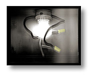 (Fig. 4) from 2003. (Fig. 4) from 2003.
This piece was produced in a series of four. It consists of a fabricated black metal box (8.5”x10.5”x5.5”) containing a porcelain electric light fixture with bulb and a cord extending from its bottom. The front of the box is covered with a glass black and white photographic transparency presenting a life-size image of the actual fixture and bulb seen through it. The work is subtitled “- an image of an object, as part of the object, illuminated by the object.” Within the space of its metal container the lit bulb reveals itself, and concurrently, like an x-ray display, makes visible the picture of itself through which it is seen. There is an optical balance demonstrated by this work; the transparency is made clear by the thing it shows, which can only be seen through its own resemblance. The close distance between the bulb and its image of the same size establishes a stable congruent composite of both for as long as we maintain our fixed viewpoint. Any change from this position causes a misalignment and partially breaks the visual mixture back into its components. The perceptual experience offered by this piece enables us to fleetingly hold and clarify the connection between what actually is and a picture of it. More importantly, the composite image of bulb and picture as one simultaneous vision registers most clearly what we normally carry in memory- a picture from the mind’s eye exhibiting a remembered combination of experience and illusion. This visual juxtaposition of object and its simulation exemplifies the complicated co-dependence of pictures and their subjects, a dichotomy from which Daniel often draws inspiration for aesthetic expression. The attention he gives to photography as a subject or issue in his work is not a passing interest. He shares with many a concern for the social and political implications of the visual medium, namely, how it functions to establish imitative alternatives and the resultant mindsets associated with the acceptance of such visual substitutions. More crucial than the fact that we confuse simulation with the actual is the question- who or what determines which of our illusions get to be considered appropriate and useful to function as our realities? Daniel once stated that if he were ever caught running a red light by a surveillance camera at an intersection and issued a traffic violation he would take photos of money and send them to the appropriate authorities to pay his fine. While quite humorous, we know this would never work; still, we’re fascinated by the prospect because there is something about this plan that seems so right, so reasonable. He is actually proposing a response in kind one arriving from an attempt to be fair. He suggests that the belief that a process for making illusions on paper and on monitor screens can show something that happened in space and time should be matched and consistent with the belief that the same process is an acceptable means by which to deal with those visually documented occurrences. Daniel’s proposed method of payment exposes an obvious conflict in the way we utilize illusions where one simulation is not equivalent to another. But why are we not more consistent? Why is one illusion more acceptable than another; why do the simulated realities of photography, film, and video have more credibility than the simulated realities of photography, film, and video used as responses to them? Visual media documents in the same way that a verbal description narrates some occurrence, it just does it better, supposedly, because its credibility is based on its technical function as a substitute for the sense of sight. Of course, Daniel’s statement was simply intended to offer up and address this discrepancy - the absurdity of spending the “look” of money punctuates the common and acceptable fallacy of insisting that photographic processes present reality rather than document it. Using a picture of a moving car taken at some specific time and in some position determined by the placement of a camera is as equally unreasonable as using pictures of money to pay fines especially if you consider that the photographic evidence for both is the same unreality- just visual illusions. For most, this obviousness of false, illusional evidence doesn’t matter; its use is validated by the focus of its intention. In this case one simulation is used to keep us from running red lights while the objection to the other insures real money for the proper authorities. The idea of a facsimile can’t exist very long when the physically fictitious thing acts in the same way as that which it imitates. But as we all know common snapshots of money are not counterfeit notes. Paying your fine in photographs would probably result in receiving some reprimanding response informing you that your joke was not appreciated while paying it in counterfeit money could get you time in jail. We don’t spent pictures of money for the same reason we don’t expect a picture of a bus to take us somewhere. This attests to the fact that we always make the distinction between any form of visual media and what it shows. Yet, how we normally communicate about photography indicates some commonly practiced thought pattern involving an abbreviated conclusion about the subject; we automatically equate photography and actuality. Pictures can even be used in a courtroom as documented evidence that something took place, but ironically, they can also be utilized to demonstrate that what they show is inert and unreal, i.e. images of water aren’t wet, and those of knives don’t cut. In addition to the areas of simulation and imitative media JB Daniel finds fertile territory for aesthetic possibilities in linguistics. Many of his pieces utilize and are about language. Daniel’s BANG (2005-06) 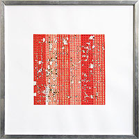 (Fig. 5) series consists of framed, grid compositions made from roll caps pasted adjacently in parallel rows to establish red rectangular fields. Now difficult to find, caps were originally manufactured as “ammunition” for toy guns. They are long lengths of narrow paper rolled into small coils. The paper laminates small dots of explosive power positioned equidistantly throughout its length. When loaded into the toy gun, pulling the trigger advances the roll of caps and an individual powder dot is struck and exploded creating a loud bang that simulates gunfire. Daniel establishes his red fields of caps with their coordinate system of dots as the context in which he explores the aesthetic possibilities of contingent combinations. Using the steel letters and numbers made for stamping into wooden surfaces he explodes specific caps within the grid by placing the metal symbols on them and striking them with a hammer. When compressed and ignited in this way these small, detonated patches leave a clear and precise trace of the letter within a totally devastated area of scorched and disrupted paper. Through this process he creates “crossword” structures of vertically and horizontally oriented words built from a sharing of letters. Each BANG in the series presents three different kinds of words determined by a list of either nouns or verbs or adjectives. One presents: “Ideologies, Cat Names, and Types of Pasta;” another offers: “Dead Cowboys, Verbs of Being, and Microwave Directions for Chicken Pot Pie.” While inherently “surreal” and disconnected as combinations, his words are made interdependent by the letters they share and their grided context. Within the red matrix of smooth paper and regimented dots each small eruption with its individual chaotic identity is distinct; yet, in combination, they delineate damaged surfaces that meet, compete, and extend into one another. These small, sooted letters with their torn and discolored surroundings are vaguely reminiscent of Jasper John’s painterly alphabet and number paintings. They are strangely beautiful displays of familiar symbols playing new, unexpected roles affording them individual character and singularity.
In producing their letters and words these small explosions literally demonstrate disorder within the coherent system they simultaneously build. As a consequence this duality of language and physicality can’t help but suggest various metaphorical possibilities, i.e. the disruptive capacity of language, the equality of inert words, the price we pay for using language to mediate reality, and, more generally, the origins of language itself. These are but a few possibilities. (Fig. 5) series consists of framed, grid compositions made from roll caps pasted adjacently in parallel rows to establish red rectangular fields. Now difficult to find, caps were originally manufactured as “ammunition” for toy guns. They are long lengths of narrow paper rolled into small coils. The paper laminates small dots of explosive power positioned equidistantly throughout its length. When loaded into the toy gun, pulling the trigger advances the roll of caps and an individual powder dot is struck and exploded creating a loud bang that simulates gunfire. Daniel establishes his red fields of caps with their coordinate system of dots as the context in which he explores the aesthetic possibilities of contingent combinations. Using the steel letters and numbers made for stamping into wooden surfaces he explodes specific caps within the grid by placing the metal symbols on them and striking them with a hammer. When compressed and ignited in this way these small, detonated patches leave a clear and precise trace of the letter within a totally devastated area of scorched and disrupted paper. Through this process he creates “crossword” structures of vertically and horizontally oriented words built from a sharing of letters. Each BANG in the series presents three different kinds of words determined by a list of either nouns or verbs or adjectives. One presents: “Ideologies, Cat Names, and Types of Pasta;” another offers: “Dead Cowboys, Verbs of Being, and Microwave Directions for Chicken Pot Pie.” While inherently “surreal” and disconnected as combinations, his words are made interdependent by the letters they share and their grided context. Within the red matrix of smooth paper and regimented dots each small eruption with its individual chaotic identity is distinct; yet, in combination, they delineate damaged surfaces that meet, compete, and extend into one another. These small, sooted letters with their torn and discolored surroundings are vaguely reminiscent of Jasper John’s painterly alphabet and number paintings. They are strangely beautiful displays of familiar symbols playing new, unexpected roles affording them individual character and singularity.
In producing their letters and words these small explosions literally demonstrate disorder within the coherent system they simultaneously build. As a consequence this duality of language and physicality can’t help but suggest various metaphorical possibilities, i.e. the disruptive capacity of language, the equality of inert words, the price we pay for using language to mediate reality, and, more generally, the origins of language itself. These are but a few possibilities.
Another of his works arising from a more specific interest in linguistics is his IS, AND, THE 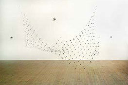 (Fig. 6) from 2001. It hangs as a net-like structure made from lead and monofilament. While its overall size as constructed measures 15’x10’x10,’ it can be configured into different dimensions by altering its height from the floor. It consists of many round, flat lead seals joining long strands of monofilament at right angles allowing them to support the coin-like connections in one large planer field. This open fabric is held up by three lines passing through hooks attached to the ceiling and then tied onto lead weights the combined heaviness of which equals that of the hanging. This counterpoised suspension allows the piece to maintain stability in one position and then be moved up and down to establish other equally steady configurations. Every new position generates a new shape for the whole and also demands that all the small lead parts find new relationships. When exhibited viewers are encouraged to continuously reconfigure the work. (Fig. 6) from 2001. It hangs as a net-like structure made from lead and monofilament. While its overall size as constructed measures 15’x10’x10,’ it can be configured into different dimensions by altering its height from the floor. It consists of many round, flat lead seals joining long strands of monofilament at right angles allowing them to support the coin-like connections in one large planer field. This open fabric is held up by three lines passing through hooks attached to the ceiling and then tied onto lead weights the combined heaviness of which equals that of the hanging. This counterpoised suspension allows the piece to maintain stability in one position and then be moved up and down to establish other equally steady configurations. Every new position generates a new shape for the whole and also demands that all the small lead parts find new relationships. When exhibited viewers are encouraged to continuously reconfigure the work.
More than simply an interactive piece IS, AND, THE manifests physically a grammatical construct. Each of the small lead seals has stamped into its surface the word “is.” As the building units for this ever-changing, floating matrix they position the filaments to equidistantly connect themselves with each other. Without other words with which to combine (nouns, adjectives, and adverbs) these attached “ises” exist to make continual equations between themselves functioning somewhat like “A rose is a rose…” but lacking the articles and nouns. Daniel has developed this piece from his interest in E-Prime, the omission of the verb “to be” from English usage. Understanding that the word “is” falsely connects and fixes one thing as another or suggests some inner absolute quality for a thing, here the artist builds a reverse construct for E-Prime to make his point. By including only this small word in his structure he eliminates any possibility of it equating anything other than itself with itself, or as stated in plain English- the only equivalent to “is” is “is.” Without further explanation and elaboration of the more complex aspects of E-Prime Daniel’s work might entail, it basically functions as an inverse model for the linguistic concept putting “isness” in its proper place as the principal unit in a self-referential grammatical system that abbreviates reality by simplifying the pursuit of meaning. The artist has longed believed that the structure and practice of language determines the cognitive and perceptual perspectives constituting our awareness. In addition, as he normally demonstrates, our linguistic experiences and studies also offer a wealth of possibilities for aesthetic expression. JB Daniel both finds and makes what works; he communicates between understatement and overstatement in aesthetic ways, not informative ones. His art is neither process nor media heavy, and, while often complex, it’s for reasons other than intentionally mystifying or hawking pieces of esoteric information as substitutes for artistic prowess. The brilliance of his art is always close, but seldom immediate; its distance is eliminated more quickly by self-introspection than by understanding what he presents. The artist conceives and executes his art through a calculated intention to “undo” his audience, so its calm accessibility and precision invites you in at a price. The new place afforded the things he puts together initiates a perceptual and cognitive expansion where something more extraordinary is revealed. Daniel’s visual situations disrupt and attack the assumptions, expectations, and perceptual convictions we have in place, but they do this delicately without the complexities of abstruse information or the obviousness of shock value. His works softly confound to reveal. |
X close